1012 lines
32 KiB
Dart
1012 lines
32 KiB
Dart
// Copyright 2014 The Flutter Authors. All rights reserved.
|
|
// Use of this source code is governed by a BSD-style license that can be
|
|
// found in the LICENSE file.
|
|
|
|
// Dart imports:
|
|
import 'dart:math' as math;
|
|
|
|
// Flutter imports:
|
|
import 'package:flutter/foundation.dart';
|
|
import 'package:flutter/material.dart';
|
|
import 'package:flutter/rendering.dart';
|
|
|
|
// TODO remove this class, it's needed to fix this issue:
|
|
// https://github.com/flutter/flutter/issues/21864
|
|
|
|
/// Signature for [DataColumn.onSort] callback.
|
|
typedef DataColumnSortCallback = void Function(int columnIndex, bool ascending);
|
|
|
|
/// Column configuration for a [DataTable].
|
|
///
|
|
/// One column configuration must be provided for each column to
|
|
/// display in the table. The list of [DataColumn] objects is passed
|
|
/// as the `columns` argument to the [new DataTable] constructor.
|
|
@immutable
|
|
class DataColumn {
|
|
/// Creates the configuration for a column of a [DataTable].
|
|
///
|
|
/// The [label] argument must not be null.
|
|
const DataColumn({
|
|
@required this.label,
|
|
this.tooltip,
|
|
this.numeric = false,
|
|
this.onSort,
|
|
}) : assert(label != null);
|
|
|
|
/// The column heading.
|
|
///
|
|
/// Typically, this will be a [Text] widget. It could also be an
|
|
/// [Icon] (typically using size 18), or a [Row] with an icon and
|
|
/// some text.
|
|
///
|
|
/// By default, this widget will only occupy the minimal space. If you want
|
|
/// it to take the entire remaining space, e.g. when you want to use [Center],
|
|
/// you can wrap it with an [Expanded].
|
|
///
|
|
/// The label should not include the sort indicator.
|
|
final Widget label;
|
|
|
|
/// The column heading's tooltip.
|
|
///
|
|
/// This is a longer description of the column heading, for cases
|
|
/// where the heading might have been abbreviated to keep the column
|
|
/// width to a reasonable size.
|
|
final String tooltip;
|
|
|
|
/// Whether this column represents numeric data or not.
|
|
///
|
|
/// The contents of cells of columns containing numeric data are
|
|
/// right-aligned.
|
|
final bool numeric;
|
|
|
|
/// Called when the user asks to sort the table using this column.
|
|
///
|
|
/// If null, the column will not be considered sortable.
|
|
///
|
|
/// See [DataTable.sortColumnIndex] and [DataTable.sortAscending].
|
|
final DataColumnSortCallback onSort;
|
|
|
|
bool get _debugInteractive => onSort != null;
|
|
}
|
|
|
|
/// Row configuration and cell data for a [DataTable].
|
|
///
|
|
/// One row configuration must be provided for each row to
|
|
/// display in the table. The list of [DataRow] objects is passed
|
|
/// as the `rows` argument to the [new DataTable] constructor.
|
|
///
|
|
/// The data for this row of the table is provided in the [cells]
|
|
/// property of the [DataRow] object.
|
|
@immutable
|
|
class DataRow {
|
|
/// Creates the configuration for a row of a [DataTable].
|
|
///
|
|
/// The [cells] argument must not be null.
|
|
const DataRow({
|
|
this.key,
|
|
this.selected = false,
|
|
this.onSelectChanged,
|
|
@required this.cells,
|
|
}) : assert(cells != null);
|
|
|
|
/// Creates the configuration for a row of a [DataTable], deriving
|
|
/// the key from a row index.
|
|
///
|
|
/// The [cells] argument must not be null.
|
|
DataRow.byIndex({
|
|
int index,
|
|
this.selected = false,
|
|
this.onSelectChanged,
|
|
@required this.cells,
|
|
}) : assert(cells != null),
|
|
key = ValueKey<int>(index);
|
|
|
|
/// A [Key] that uniquely identifies this row. This is used to
|
|
/// ensure that if a row is added or removed, any stateful widgets
|
|
/// related to this row (e.g. an in-progress checkbox animation)
|
|
/// remain on the right row visually.
|
|
///
|
|
/// If the table never changes once created, no key is necessary.
|
|
final LocalKey key;
|
|
|
|
/// Called when the user selects or unselects a selectable row.
|
|
///
|
|
/// If this is not null, then the row is selectable. The current
|
|
/// selection state of the row is given by [selected].
|
|
///
|
|
/// If any row is selectable, then the table's heading row will have
|
|
/// a checkbox that can be checked to select all selectable rows
|
|
/// (and which is checked if all the rows are selected), and each
|
|
/// subsequent row will have a checkbox to toggle just that row.
|
|
///
|
|
/// A row whose [onSelectChanged] callback is null is ignored for
|
|
/// the purposes of determining the state of the "all" checkbox,
|
|
/// and its checkbox is disabled.
|
|
final ValueChanged<bool> onSelectChanged;
|
|
|
|
/// Whether the row is selected.
|
|
///
|
|
/// If [onSelectChanged] is non-null for any row in the table, then
|
|
/// a checkbox is shown at the start of each row. If the row is
|
|
/// selected (true), the checkbox will be checked and the row will
|
|
/// be highlighted.
|
|
///
|
|
/// Otherwise, the checkbox, if present, will not be checked.
|
|
final bool selected;
|
|
|
|
/// The data for this row.
|
|
///
|
|
/// There must be exactly as many cells as there are columns in the
|
|
/// table.
|
|
final List<DataCell> cells;
|
|
|
|
bool get _debugInteractive =>
|
|
onSelectChanged != null ||
|
|
cells.any((DataCell cell) => cell._debugInteractive);
|
|
}
|
|
|
|
/// The data for a cell of a [DataTable].
|
|
///
|
|
/// One list of [DataCell] objects must be provided for each [DataRow]
|
|
/// in the [DataTable], in the [new DataRow] constructor's `cells`
|
|
/// argument.
|
|
@immutable
|
|
class DataCell {
|
|
/// Creates an object to hold the data for a cell in a [DataTable].
|
|
///
|
|
/// The first argument is the widget to show for the cell, typically
|
|
/// a [Text] or [DropdownButton] widget; this becomes the [child]
|
|
/// property and must not be null.
|
|
///
|
|
/// If the cell has no data, then a [Text] widget with placeholder
|
|
/// text should be provided instead, and then the [placeholder]
|
|
/// argument should be set to true.
|
|
const DataCell(
|
|
this.child, {
|
|
this.placeholder = false,
|
|
this.showEditIcon = false,
|
|
this.onTap,
|
|
this.onLongPress,
|
|
this.backgroundColor,
|
|
}) : assert(child != null);
|
|
|
|
/// A cell that has no content and has zero width and height.
|
|
static const DataCell empty = DataCell(SizedBox(width: 0.0, height: 0.0));
|
|
|
|
/// The data for the row.
|
|
///
|
|
/// Typically a [Text] widget or a [DropdownButton] widget.
|
|
///
|
|
/// If the cell has no data, then a [Text] widget with placeholder
|
|
/// text should be provided instead, and [placeholder] should be set
|
|
/// to true.
|
|
///
|
|
/// {@macro flutter.widgets.child}
|
|
final Widget child;
|
|
|
|
/// Whether the [child] is actually a placeholder.
|
|
///
|
|
/// If this is true, the default text style for the cell is changed
|
|
/// to be appropriate for placeholder text.
|
|
final bool placeholder;
|
|
|
|
/// Whether to show an edit icon at the end of the cell.
|
|
///
|
|
/// This does not make the cell actually editable; the caller must
|
|
/// implement editing behavior if desired (initiated from the
|
|
/// [onTap] callback).
|
|
///
|
|
/// If this is set, [onTap] should also be set, otherwise tapping
|
|
/// the icon will have no effect.
|
|
final bool showEditIcon;
|
|
|
|
/// Called if the cell is tapped.
|
|
///
|
|
/// If non-null, tapping the cell will call this callback. If
|
|
/// null, tapping the cell will attempt to select the row (if
|
|
/// [DataRow.onSelectChanged] is provided).
|
|
final VoidCallback onTap;
|
|
|
|
final VoidCallback onLongPress;
|
|
|
|
final Color backgroundColor;
|
|
|
|
bool get _debugInteractive => onTap != null;
|
|
}
|
|
|
|
/// A material design data table.
|
|
///
|
|
/// {@youtube 560 315 https://www.youtube.com/watch?v=ktTajqbhIcY}
|
|
///
|
|
/// Displaying data in a table is expensive, because to lay out the
|
|
/// table all the data must be measured twice, once to negotiate the
|
|
/// dimensions to use for each column, and once to actually lay out
|
|
/// the table given the results of the negotiation.
|
|
///
|
|
/// For this reason, if you have a lot of data (say, more than a dozen
|
|
/// rows with a dozen columns, though the precise limits depend on the
|
|
/// target device), it is suggested that you use a
|
|
/// [PaginatedDataTable] which automatically splits the data into
|
|
/// multiple pages.
|
|
///
|
|
/// {@tool dartpad --template=stateless_widget_scaffold}
|
|
///
|
|
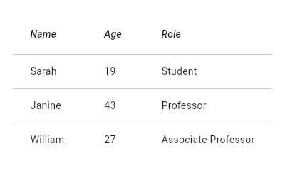
/// This sample shows how to display a [DataTable] with three columns: name, age, and
|
|
/// role. The columns are defined by three [DataColumn] objects. The table
|
|
/// contains three rows of data for three example users, the data for which
|
|
/// is defined by three [DataRow] objects.
|
|
///
|
|
/// 
|
|
///
|
|
/// ```dart
|
|
/// Widget build(BuildContext context) {
|
|
/// return DataTable(
|
|
/// columns: const <DataColumn>[
|
|
/// DataColumn(
|
|
/// label: Text(
|
|
/// 'Name',
|
|
/// style: TextStyle(fontStyle: FontStyle.italic),
|
|
/// ),
|
|
/// ),
|
|
/// DataColumn(
|
|
/// label: Text(
|
|
/// 'Age',
|
|
/// style: TextStyle(fontStyle: FontStyle.italic),
|
|
/// ),
|
|
/// ),
|
|
/// DataColumn(
|
|
/// label: Text(
|
|
/// 'Role',
|
|
/// style: TextStyle(fontStyle: FontStyle.italic),
|
|
/// ),
|
|
/// ),
|
|
/// ],
|
|
/// rows: const <DataRow>[
|
|
/// DataRow(
|
|
/// cells: <DataCell>[
|
|
/// DataCell(Text('Sarah')),
|
|
/// DataCell(Text('19')),
|
|
/// DataCell(Text('Student')),
|
|
/// ],
|
|
/// ),
|
|
/// DataRow(
|
|
/// cells: <DataCell>[
|
|
/// DataCell(Text('Janine')),
|
|
/// DataCell(Text('43')),
|
|
/// DataCell(Text('Professor')),
|
|
/// ],
|
|
/// ),
|
|
/// DataRow(
|
|
/// cells: <DataCell>[
|
|
/// DataCell(Text('William')),
|
|
/// DataCell(Text('27')),
|
|
/// DataCell(Text('Associate Professor')),
|
|
/// ],
|
|
/// ),
|
|
/// ],
|
|
/// );
|
|
/// }
|
|
/// ```
|
|
///
|
|
/// {@end-tool}
|
|
///
|
|
/// See also:
|
|
///
|
|
/// * [DataColumn], which describes a column in the data table.
|
|
/// * [DataRow], which contains the data for a row in the data table.
|
|
/// * [DataCell], which contains the data for a single cell in the data table.
|
|
/// * [PaginatedDataTable], which shows part of the data in a data table and
|
|
/// provides controls for paging through the remainder of the data.
|
|
/// * <https://material.io/design/components/data-tables.html>
|
|
class AppDataTable extends StatelessWidget {
|
|
/// Creates a widget describing a data table.
|
|
///
|
|
/// The [columns] argument must be a list of as many [DataColumn]
|
|
/// objects as the table is to have columns, ignoring the leading
|
|
/// checkbox column if any. The [columns] argument must have a
|
|
/// length greater than zero and must not be null.
|
|
///
|
|
/// The [rows] argument must be a list of as many [DataRow] objects
|
|
/// as the table is to have rows, ignoring the leading heading row
|
|
/// that contains the column headings (derived from the [columns]
|
|
/// argument). There may be zero rows, but the rows argument must
|
|
/// not be null.
|
|
///
|
|
/// Each [DataRow] object in [rows] must have as many [DataCell]
|
|
/// objects in the [DataRow.cells] list as the table has columns.
|
|
///
|
|
/// If the table is sorted, the column that provides the current
|
|
/// primary key should be specified by index in [sortColumnIndex], 0
|
|
/// meaning the first column in [columns], 1 being the next one, and
|
|
/// so forth.
|
|
///
|
|
/// The actual sort order can be specified using [sortAscending]; if
|
|
/// the sort order is ascending, this should be true (the default),
|
|
/// otherwise it should be false.
|
|
AppDataTable({
|
|
Key key,
|
|
@required this.columns,
|
|
this.sortColumnIndex,
|
|
this.sortAscending = true,
|
|
this.onSelectAll,
|
|
this.dataRowHeight = kMinInteractiveDimension,
|
|
this.headingRowHeight = 56.0,
|
|
this.horizontalMargin = 24.0,
|
|
this.columnSpacing = 56.0,
|
|
this.showCheckboxColumn = true,
|
|
this.dividerThickness = 1.0,
|
|
@required this.rows,
|
|
}) : assert(columns != null),
|
|
assert(columns.isNotEmpty),
|
|
assert(sortColumnIndex == null ||
|
|
(sortColumnIndex >= 0 && sortColumnIndex < columns.length)),
|
|
assert(sortAscending != null),
|
|
assert(dataRowHeight != null),
|
|
assert(headingRowHeight != null),
|
|
assert(horizontalMargin != null),
|
|
assert(columnSpacing != null),
|
|
assert(showCheckboxColumn != null),
|
|
assert(rows != null),
|
|
assert(!rows.any((DataRow row) => row.cells.length != columns.length)),
|
|
assert(dividerThickness != null && dividerThickness >= 0),
|
|
_onlyTextColumn = _initOnlyTextColumn(columns),
|
|
super(key: key);
|
|
|
|
/// The configuration and labels for the columns in the table.
|
|
final List<DataColumn> columns;
|
|
|
|
/// The current primary sort key's column.
|
|
///
|
|
/// If non-null, indicates that the indicated column is the column
|
|
/// by which the data is sorted. The number must correspond to the
|
|
/// index of the relevant column in [columns].
|
|
///
|
|
/// Setting this will cause the relevant column to have a sort
|
|
/// indicator displayed.
|
|
///
|
|
/// When this is null, it implies that the table's sort order does
|
|
/// not correspond to any of the columns.
|
|
final int sortColumnIndex;
|
|
|
|
/// Whether the column mentioned in [sortColumnIndex], if any, is sorted
|
|
/// in ascending order.
|
|
///
|
|
/// If true, the order is ascending (meaning the rows with the
|
|
/// smallest values for the current sort column are first in the
|
|
/// table).
|
|
///
|
|
/// If false, the order is descending (meaning the rows with the
|
|
/// smallest values for the current sort column are last in the
|
|
/// table).
|
|
final bool sortAscending;
|
|
|
|
/// Invoked when the user selects or unselects every row, using the
|
|
/// checkbox in the heading row.
|
|
///
|
|
/// If this is null, then the [DataRow.onSelectChanged] callback of
|
|
/// every row in the table is invoked appropriately instead.
|
|
///
|
|
/// To control whether a particular row is selectable or not, see
|
|
/// [DataRow.onSelectChanged]. This callback is only relevant if any
|
|
/// row is selectable.
|
|
final ValueSetter<bool> onSelectAll;
|
|
|
|
/// The height of each row (excluding the row that contains column headings).
|
|
///
|
|
/// This value defaults to kMinInteractiveDimension to adhere to the Material
|
|
/// Design specifications.
|
|
final double dataRowHeight;
|
|
|
|
/// The height of the heading row.
|
|
///
|
|
/// This value defaults to 56.0 to adhere to the Material Design specifications.
|
|
final double headingRowHeight;
|
|
|
|
/// The horizontal margin between the edges of the table and the content
|
|
/// in the first and last cells of each row.
|
|
///
|
|
/// When a checkbox is displayed, it is also the margin between the checkbox
|
|
/// the content in the first data column.
|
|
///
|
|
/// This value defaults to 24.0 to adhere to the Material Design specifications.
|
|
final double horizontalMargin;
|
|
|
|
/// The horizontal margin between the contents of each data column.
|
|
///
|
|
/// This value defaults to 56.0 to adhere to the Material Design specifications.
|
|
final double columnSpacing;
|
|
|
|
/// {@template flutter.material.dataTable.showCheckboxColumn}
|
|
/// Whether the widget should display checkboxes for selectable rows.
|
|
///
|
|
/// If true, a [CheckBox] will be placed at the beginning of each row that is
|
|
/// selectable. However, if [DataRow.onSelectChanged] is not set for any row,
|
|
/// checkboxes will not be placed, even if this value is true.
|
|
///
|
|
/// If false, all rows will not display a [CheckBox].
|
|
/// {@endtemplate}
|
|
final bool showCheckboxColumn;
|
|
|
|
/// The data to show in each row (excluding the row that contains
|
|
/// the column headings).
|
|
///
|
|
/// Must be non-null, but may be empty.
|
|
final List<DataRow> rows;
|
|
|
|
// Set by the constructor to the index of the only Column that is
|
|
// non-numeric, if there is exactly one, otherwise null.
|
|
final int _onlyTextColumn;
|
|
|
|
static int _initOnlyTextColumn(List<DataColumn> columns) {
|
|
int result;
|
|
for (int index = 0; index < columns.length; index += 1) {
|
|
final DataColumn column = columns[index];
|
|
if (!column.numeric) {
|
|
if (result != null) {
|
|
return null;
|
|
}
|
|
result = index;
|
|
}
|
|
}
|
|
return result;
|
|
}
|
|
|
|
bool get _debugInteractive {
|
|
return columns.any((DataColumn column) => column._debugInteractive) ||
|
|
rows.any((DataRow row) => row._debugInteractive);
|
|
}
|
|
|
|
static final LocalKey _headingRowKey = UniqueKey();
|
|
|
|
void _handleSelectAll(bool checked) {
|
|
if (onSelectAll != null) {
|
|
onSelectAll(checked);
|
|
} else {
|
|
for (final DataRow row in rows) {
|
|
if ((row.onSelectChanged != null) && (row.selected != checked))
|
|
row.onSelectChanged(checked);
|
|
}
|
|
}
|
|
}
|
|
|
|
static const double _sortArrowPadding = 2.0;
|
|
static const double _headingFontSize = 12.0;
|
|
static const Duration _sortArrowAnimationDuration =
|
|
Duration(milliseconds: 160);
|
|
static const Color _grey100Opacity =
|
|
Color(0x0A000000); // Grey 100 as opacity instead of solid color
|
|
static const Color _grey300Opacity =
|
|
Color(0x1E000000); // Dark theme variant is just a guess.
|
|
|
|
/// The width of the divider that appears between [TableRow]s.
|
|
///
|
|
/// Must be non-null and greater than or equal to zero.
|
|
/// This value defaults to 1.0.
|
|
final double dividerThickness;
|
|
|
|
Widget _buildCheckbox({
|
|
Color color,
|
|
bool checked,
|
|
VoidCallback onRowTap,
|
|
ValueChanged<bool> onCheckboxChanged,
|
|
}) {
|
|
Widget contents = Semantics(
|
|
container: true,
|
|
child: Padding(
|
|
padding: EdgeInsetsDirectional.only(
|
|
start: horizontalMargin, end: horizontalMargin / 2.0),
|
|
child: Center(
|
|
child: Checkbox(
|
|
activeColor: color,
|
|
value: checked,
|
|
onChanged: onCheckboxChanged,
|
|
),
|
|
),
|
|
),
|
|
);
|
|
if (onRowTap != null) {
|
|
contents = TableRowInkWell(
|
|
onTap: onRowTap,
|
|
child: contents,
|
|
);
|
|
}
|
|
return TableCell(
|
|
verticalAlignment: TableCellVerticalAlignment.fill,
|
|
child: contents,
|
|
);
|
|
}
|
|
|
|
Widget _buildHeadingCell({
|
|
BuildContext context,
|
|
EdgeInsetsGeometry padding,
|
|
Widget label,
|
|
String tooltip,
|
|
bool numeric,
|
|
VoidCallback onSort,
|
|
bool sorted,
|
|
bool ascending,
|
|
}) {
|
|
List<Widget> arrowWithPadding() {
|
|
return onSort == null
|
|
? const <Widget>[]
|
|
: <Widget>[
|
|
_SortArrow(
|
|
visible: sorted,
|
|
down: sorted ? ascending : null,
|
|
duration: _sortArrowAnimationDuration,
|
|
),
|
|
const SizedBox(width: _sortArrowPadding),
|
|
];
|
|
}
|
|
|
|
label = Row(
|
|
textDirection: numeric ? TextDirection.rtl : null,
|
|
children: <Widget>[
|
|
label,
|
|
...arrowWithPadding(),
|
|
],
|
|
);
|
|
label = Container(
|
|
padding: padding,
|
|
height: headingRowHeight,
|
|
alignment:
|
|
numeric ? Alignment.centerRight : AlignmentDirectional.centerStart,
|
|
child: AnimatedDefaultTextStyle(
|
|
style: TextStyle(
|
|
// TODO(hansmuller): This should use the information provided by
|
|
// textTheme/DataTableTheme, https://github.com/flutter/flutter/issues/56079
|
|
fontWeight: FontWeight.w500,
|
|
fontSize: _headingFontSize,
|
|
height: math.min(1.0, headingRowHeight / _headingFontSize),
|
|
color: (Theme.of(context).brightness == Brightness.light)
|
|
? ((onSort != null && sorted) ? Colors.black87 : Colors.black54)
|
|
: ((onSort != null && sorted) ? Colors.white : Colors.white70),
|
|
),
|
|
softWrap: false,
|
|
duration: _sortArrowAnimationDuration,
|
|
child: label,
|
|
),
|
|
);
|
|
if (tooltip != null) {
|
|
label = Tooltip(
|
|
message: tooltip,
|
|
child: label,
|
|
);
|
|
}
|
|
// TODO(dkwingsmt): Only wrap Inkwell if onSort != null. Blocked by
|
|
// https://github.com/flutter/flutter/issues/51152
|
|
label = InkWell(
|
|
onTap: onSort,
|
|
child: label,
|
|
);
|
|
return label;
|
|
}
|
|
|
|
Widget _buildDataCell({
|
|
BuildContext context,
|
|
EdgeInsetsGeometry padding,
|
|
Widget label,
|
|
bool numeric,
|
|
bool placeholder,
|
|
bool showEditIcon,
|
|
Color backgroundColor,
|
|
VoidCallback onTap,
|
|
VoidCallback onLongPress,
|
|
VoidCallback onSelectChanged,
|
|
}) {
|
|
final bool isLightTheme = Theme.of(context).brightness == Brightness.light;
|
|
if (showEditIcon) {
|
|
const Widget icon = Icon(Icons.edit, size: 18.0);
|
|
label = Expanded(child: label);
|
|
label = Row(
|
|
textDirection: numeric ? TextDirection.rtl : null,
|
|
children: <Widget>[label, icon],
|
|
);
|
|
}
|
|
label = Container(
|
|
padding: padding,
|
|
height: dataRowHeight,
|
|
alignment:
|
|
numeric ? Alignment.centerRight : AlignmentDirectional.centerStart,
|
|
child: DefaultTextStyle(
|
|
style: TextStyle(
|
|
// TODO(hansmuller): This should use the information provided by
|
|
// textTheme/DataTableTheme, https://github.com/flutter/flutter/issues/56079
|
|
fontSize: 13.0,
|
|
color: isLightTheme
|
|
? (placeholder ? Colors.black38 : Colors.black87)
|
|
: (placeholder ? Colors.white38 : Colors.white70),
|
|
),
|
|
child: IconTheme.merge(
|
|
data: IconThemeData(
|
|
color: isLightTheme ? Colors.black54 : Colors.white70,
|
|
),
|
|
child: DropdownButtonHideUnderline(child: label),
|
|
),
|
|
),
|
|
);
|
|
if (onTap != null) {
|
|
label = InkWell(
|
|
onTap: onTap,
|
|
onLongPress: onLongPress,
|
|
child: label,
|
|
);
|
|
} else if (onSelectChanged != null) {
|
|
label = TableRowInkWell(
|
|
onTap: onSelectChanged,
|
|
child: label,
|
|
);
|
|
}
|
|
return DecoratedBox(
|
|
child: label,
|
|
decoration: BoxDecoration(color: backgroundColor),
|
|
);
|
|
}
|
|
|
|
@override
|
|
Widget build(BuildContext context) {
|
|
assert(!_debugInteractive || debugCheckHasMaterial(context));
|
|
|
|
final ThemeData theme = Theme.of(context);
|
|
final BoxDecoration _kSelectedDecoration = BoxDecoration(
|
|
border: Border(
|
|
bottom: Divider.createBorderSide(context, width: dividerThickness)),
|
|
// The backgroundColor has to be transparent so you can see the ink on the material
|
|
color: (Theme.of(context).brightness == Brightness.light)
|
|
? _grey100Opacity
|
|
: _grey300Opacity,
|
|
);
|
|
final BoxDecoration _kUnselectedDecoration = BoxDecoration(
|
|
border: Border(
|
|
bottom: Divider.createBorderSide(context, width: dividerThickness)),
|
|
);
|
|
|
|
final bool displayCheckboxColumn = showCheckboxColumn &&
|
|
rows.any((DataRow row) => row.onSelectChanged != null);
|
|
final bool allChecked = displayCheckboxColumn &&
|
|
!rows
|
|
.any((DataRow row) => row.onSelectChanged != null && !row.selected);
|
|
|
|
final List<TableColumnWidth> tableColumns = List<TableColumnWidth>.filled(
|
|
columns.length + (displayCheckboxColumn ? 1 : 0),
|
|
const _NullTableColumnWidth());
|
|
|
|
final List<TableRow> tableRows = List<TableRow>.generate(
|
|
rows.length + 1, // the +1 is for the header row
|
|
(int index) {
|
|
return TableRow(
|
|
key: index == 0 ? _headingRowKey : rows[index - 1].key,
|
|
decoration: index > 0 && rows[index - 1].selected
|
|
? _kSelectedDecoration
|
|
: _kUnselectedDecoration,
|
|
children:
|
|
List<Widget>.filled(tableColumns.length, const _NullWidget()),
|
|
);
|
|
},
|
|
);
|
|
|
|
int rowIndex;
|
|
|
|
int displayColumnIndex = 0;
|
|
if (displayCheckboxColumn) {
|
|
tableColumns[0] = FixedColumnWidth(
|
|
horizontalMargin + Checkbox.width + horizontalMargin / 2.0);
|
|
tableRows[0].children[0] = _buildCheckbox(
|
|
color: theme.colorScheme.secondary,
|
|
checked: allChecked,
|
|
onCheckboxChanged: _handleSelectAll,
|
|
);
|
|
rowIndex = 1;
|
|
for (final DataRow row in rows) {
|
|
tableRows[rowIndex].children[0] = _buildCheckbox(
|
|
color: theme.colorScheme.secondary,
|
|
checked: row.selected,
|
|
onRowTap: () => row.onSelectChanged != null
|
|
? row.onSelectChanged(!row.selected)
|
|
: null,
|
|
onCheckboxChanged: row.onSelectChanged,
|
|
);
|
|
rowIndex += 1;
|
|
}
|
|
displayColumnIndex += 1;
|
|
}
|
|
|
|
for (int dataColumnIndex = 0;
|
|
dataColumnIndex < columns.length;
|
|
dataColumnIndex += 1) {
|
|
final DataColumn column = columns[dataColumnIndex];
|
|
|
|
// MAKE THE FIRST COLUMN NARROWER
|
|
double paddingStart;
|
|
if (dataColumnIndex == 0) {
|
|
paddingStart = horizontalMargin / 2.0;
|
|
} else if (dataColumnIndex == 1 && !displayCheckboxColumn) {
|
|
paddingStart = horizontalMargin / 2.0;
|
|
} else {
|
|
paddingStart = columnSpacing / 2.0;
|
|
}
|
|
|
|
// MAKE THE FIRST COLUMN NARROWER
|
|
double paddingEnd;
|
|
if (dataColumnIndex == 0) {
|
|
paddingEnd = horizontalMargin / 2.0;
|
|
} else if (dataColumnIndex == columns.length - 1) {
|
|
paddingEnd = horizontalMargin;
|
|
} else {
|
|
paddingEnd = columnSpacing / 2.0;
|
|
}
|
|
|
|
final EdgeInsetsDirectional padding = EdgeInsetsDirectional.only(
|
|
start: paddingStart,
|
|
end: paddingEnd,
|
|
);
|
|
if (dataColumnIndex == _onlyTextColumn) {
|
|
tableColumns[displayColumnIndex] =
|
|
const IntrinsicColumnWidth(flex: 1.0);
|
|
} else {
|
|
tableColumns[displayColumnIndex] = const IntrinsicColumnWidth();
|
|
}
|
|
tableRows[0].children[displayColumnIndex] = _buildHeadingCell(
|
|
context: context,
|
|
padding: padding,
|
|
label: column.label,
|
|
tooltip: column.tooltip,
|
|
numeric: column.numeric,
|
|
onSort: column.onSort != null
|
|
? () => column.onSort(dataColumnIndex,
|
|
sortColumnIndex != dataColumnIndex || !sortAscending)
|
|
: null,
|
|
// IGNORE SORTING ON FIRST COLUMN
|
|
sorted: displayCheckboxColumn
|
|
? dataColumnIndex == sortColumnIndex
|
|
: (dataColumnIndex - 1) == sortColumnIndex,
|
|
ascending: sortAscending,
|
|
);
|
|
rowIndex = 1;
|
|
for (final DataRow row in rows) {
|
|
final DataCell cell = row.cells[dataColumnIndex];
|
|
tableRows[rowIndex].children[displayColumnIndex] = _buildDataCell(
|
|
context: context,
|
|
padding: padding,
|
|
label: cell.child,
|
|
numeric: column.numeric,
|
|
placeholder: cell.placeholder,
|
|
showEditIcon: cell.showEditIcon,
|
|
onTap: cell.onTap,
|
|
onLongPress: cell.onLongPress,
|
|
backgroundColor: cell.backgroundColor,
|
|
onSelectChanged: () => row.onSelectChanged != null
|
|
? row.onSelectChanged(!row.selected)
|
|
: null,
|
|
);
|
|
rowIndex += 1;
|
|
}
|
|
displayColumnIndex += 1;
|
|
}
|
|
|
|
return Table(
|
|
columnWidths: tableColumns.asMap(),
|
|
children: tableRows,
|
|
);
|
|
}
|
|
}
|
|
|
|
/// A rectangular area of a Material that responds to touch but clips
|
|
/// its ink splashes to the current table row of the nearest table.
|
|
///
|
|
/// Must have an ancestor [Material] widget in which to cause ink
|
|
/// reactions and an ancestor [Table] widget to establish a row.
|
|
///
|
|
/// The [TableRowInkWell] must be in the same coordinate space (modulo
|
|
/// translations) as the [Table]. If it's rotated or scaled or
|
|
/// otherwise transformed, it will not be able to describe the
|
|
/// rectangle of the row in its own coordinate system as a [Rect], and
|
|
/// thus the splash will not occur. (In general, this is easy to
|
|
/// achieve: just put the [TableRowInkWell] as the direct child of the
|
|
/// [Table], and put the other contents of the cell inside it.)
|
|
class TableRowInkWell extends InkResponse {
|
|
/// Creates an ink well for a table row.
|
|
const TableRowInkWell({
|
|
Key key,
|
|
Widget child,
|
|
GestureTapCallback onTap,
|
|
GestureTapCallback onDoubleTap,
|
|
GestureLongPressCallback onLongPress,
|
|
ValueChanged<bool> onHighlightChanged,
|
|
}) : super(
|
|
key: key,
|
|
child: child,
|
|
onTap: onTap,
|
|
onDoubleTap: onDoubleTap,
|
|
onLongPress: onLongPress,
|
|
onHighlightChanged: onHighlightChanged,
|
|
containedInkWell: true,
|
|
highlightShape: BoxShape.rectangle,
|
|
);
|
|
|
|
@override
|
|
RectCallback getRectCallback(RenderBox referenceBox) {
|
|
return () {
|
|
RenderObject cell = referenceBox;
|
|
AbstractNode table = cell.parent;
|
|
final Matrix4 transform = Matrix4.identity();
|
|
while (table is RenderObject && table is! RenderTable) {
|
|
final RenderObject parentBox = table as RenderObject;
|
|
parentBox.applyPaintTransform(cell, transform);
|
|
assert(table == cell.parent);
|
|
cell = parentBox;
|
|
table = table.parent;
|
|
}
|
|
if (table is RenderTable) {
|
|
final TableCellParentData cellParentData =
|
|
cell.parentData as TableCellParentData;
|
|
assert(cellParentData.y != null);
|
|
final Rect rect = table.getRowBox(cellParentData.y);
|
|
// The rect is in the table's coordinate space. We need to change it to the
|
|
// TableRowInkWell's coordinate space.
|
|
table.applyPaintTransform(cell, transform);
|
|
final Offset offset = MatrixUtils.getAsTranslation(transform);
|
|
if (offset != null) {
|
|
return rect.shift(-offset);
|
|
}
|
|
}
|
|
return Rect.zero;
|
|
};
|
|
}
|
|
|
|
@override
|
|
bool debugCheckContext(BuildContext context) {
|
|
assert(debugCheckHasTable(context));
|
|
return super.debugCheckContext(context);
|
|
}
|
|
}
|
|
|
|
class _SortArrow extends StatefulWidget {
|
|
const _SortArrow({
|
|
Key key,
|
|
this.visible,
|
|
this.down,
|
|
this.duration,
|
|
}) : super(key: key);
|
|
|
|
final bool visible;
|
|
|
|
final bool down;
|
|
|
|
final Duration duration;
|
|
|
|
@override
|
|
_SortArrowState createState() => _SortArrowState();
|
|
}
|
|
|
|
class _SortArrowState extends State<_SortArrow> with TickerProviderStateMixin {
|
|
AnimationController _opacityController;
|
|
Animation<double> _opacityAnimation;
|
|
|
|
AnimationController _orientationController;
|
|
Animation<double> _orientationAnimation;
|
|
double _orientationOffset = 0.0;
|
|
|
|
bool _down;
|
|
|
|
static final Animatable<double> _turnTween =
|
|
Tween<double>(begin: 0.0, end: math.pi)
|
|
.chain(CurveTween(curve: Curves.easeIn));
|
|
|
|
@override
|
|
void initState() {
|
|
super.initState();
|
|
_opacityAnimation = CurvedAnimation(
|
|
parent: _opacityController = AnimationController(
|
|
duration: widget.duration,
|
|
vsync: this,
|
|
),
|
|
curve: Curves.fastOutSlowIn,
|
|
)..addListener(_rebuild);
|
|
_opacityController.value = widget.visible ? 1.0 : 0.0;
|
|
_orientationController = AnimationController(
|
|
duration: widget.duration,
|
|
vsync: this,
|
|
);
|
|
_orientationAnimation = _orientationController.drive(_turnTween)
|
|
..addListener(_rebuild)
|
|
..addStatusListener(_resetOrientationAnimation);
|
|
if (widget.visible) {
|
|
_orientationOffset = widget.down ? 0.0 : math.pi;
|
|
}
|
|
}
|
|
|
|
void _rebuild() {
|
|
setState(() {
|
|
// The animations changed, so we need to rebuild.
|
|
});
|
|
}
|
|
|
|
void _resetOrientationAnimation(AnimationStatus status) {
|
|
if (status == AnimationStatus.completed) {
|
|
assert(_orientationAnimation.value == math.pi);
|
|
_orientationOffset += math.pi;
|
|
_orientationController.value =
|
|
0.0; // TODO(ianh): This triggers a pointless rebuild.
|
|
}
|
|
}
|
|
|
|
@override
|
|
void didUpdateWidget(_SortArrow oldWidget) {
|
|
super.didUpdateWidget(oldWidget);
|
|
bool skipArrow = false;
|
|
final bool newDown = widget.down ?? _down;
|
|
if (oldWidget.visible != widget.visible) {
|
|
if (widget.visible &&
|
|
(_opacityController.status == AnimationStatus.dismissed)) {
|
|
_orientationController.stop();
|
|
_orientationController.value = 0.0;
|
|
_orientationOffset = newDown ? 0.0 : math.pi;
|
|
skipArrow = true;
|
|
}
|
|
if (widget.visible) {
|
|
_opacityController.forward();
|
|
} else {
|
|
_opacityController.reverse();
|
|
}
|
|
}
|
|
if ((_down != newDown) && !skipArrow) {
|
|
if (_orientationController.status == AnimationStatus.dismissed) {
|
|
_orientationController.forward();
|
|
} else {
|
|
_orientationController.reverse();
|
|
}
|
|
}
|
|
_down = newDown;
|
|
}
|
|
|
|
@override
|
|
void dispose() {
|
|
_opacityController.dispose();
|
|
_orientationController.dispose();
|
|
super.dispose();
|
|
}
|
|
|
|
static const double _arrowIconBaselineOffset = -1.5;
|
|
static const double _arrowIconSize = 16.0;
|
|
|
|
@override
|
|
Widget build(BuildContext context) {
|
|
return Opacity(
|
|
opacity: _opacityAnimation.value,
|
|
child: Transform(
|
|
transform:
|
|
Matrix4.rotationZ(_orientationOffset + _orientationAnimation.value)
|
|
..setTranslationRaw(0.0, _arrowIconBaselineOffset, 0.0),
|
|
alignment: Alignment.center,
|
|
child: Icon(
|
|
Icons.arrow_downward,
|
|
size: _arrowIconSize,
|
|
color: (Theme.of(context).brightness == Brightness.light)
|
|
? Colors.black87
|
|
: Colors.white70,
|
|
),
|
|
),
|
|
);
|
|
}
|
|
}
|
|
|
|
class _NullTableColumnWidth extends TableColumnWidth {
|
|
const _NullTableColumnWidth();
|
|
|
|
@override
|
|
double maxIntrinsicWidth(Iterable<RenderBox> cells, double containerWidth) =>
|
|
throw UnimplementedError();
|
|
|
|
@override
|
|
double minIntrinsicWidth(Iterable<RenderBox> cells, double containerWidth) =>
|
|
throw UnimplementedError();
|
|
}
|
|
|
|
class _NullWidget extends Widget {
|
|
const _NullWidget();
|
|
|
|
@override
|
|
Element createElement() => throw UnimplementedError();
|
|
}
|